
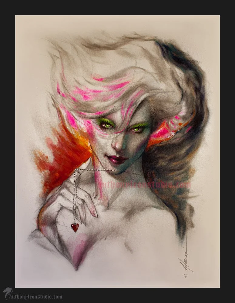
This art was for a gallery show with the them of RED and how it influences our emotions. It started as a made up pose and portrait. I was just sketching in my studio and had a good pose worked out. I wanted it to have a theme though so I added the hand and necklace. My idea was to show how we can become wrapped up in a relationship or desire and it can effect our life or well being. I wanted the art to be loose and with energy. So after doing my drawing I spray fixed it and then mounted it to a board with archival glue. I then coat it with clear gesso to seal the drawing. I can then add the color any way I like. Sometimes that is with oil paint. But this one was with acrylic and the hot pink was a color pencil. The surface was Crane paper that I like because it is a nice soft surface for drawing and keeps me loose. It is not good for erasing since it is a letterpress paper.
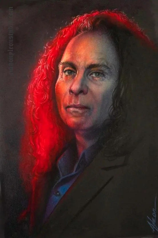
RONNIE JAMES DIO
Another evening artwork. I bought some sheets of a paper made in France by Clairefontaine called Pastelmat. Wanted to try it out with my Polychromos pencils and some liquid graphite. So I picked a black and white picture I had of Ronnie James Dio. Dio was a singer and was in a band called Elf and then formed Rainbow with Ritchie Blackmore in the late seventies. That was an amazing band. Anyway he then left and in 1980 he joined Black Sabbath after they fired Ozzy. Then left that after a couple albums to only return later for a new album and a couple tours. For what seems a legal situation the band was called Heaven and Hell. He died from stomach cancer in 2010. Dio was one of the greatest rock singers in my opinion. Especially from the Rainbow and early time in Sabbath. Now that you have a little of his history you know why I chose him for this. I think this paper is quite good for this style of art but it has a couple mistakes from learning so the next one should improve. Mainly the liquid graphite is a little touchy on this hard surface paper. But the pencils layered very well for a first attempt. I liked the way the pencils were able to cover but then have colors layered on top without messing up the paper. This sheet I used was a bluish grey in medium value. I chose it because of the colors I wanted to use it would give a good base. I glued it to a thick board so the paper would stay flat. I will definitely give this a try again with another subject on a bigger sheet. This one was about 9x12. #anthonyleonstudio #dio #ronniejamesdio #pastelmat #rocksinger #clairefontaine #rockmusician #portraitdrawing
Tamara de Lempicka
So today I have this art that is based on the artist Tamara de Lempicka. She is known for her Art Deco style paintings of women and various subjects. I have always liked her art and stylized figures. This is my drawing that I will be painting over with transparent oils. And building up to some opaque parts so I can layer on the highlights. I start with design sketches of the pose and work out ideas for the background pattern. I wanted the backgrounds on this set to all the same theme and look. Like it`s wallpaper or a room panel with art on it. This is certainly more in the area of my main interests with the Art Deco influence and the stylized figure. The drawing is 9x17 and all graphite on Saunders Waterford hot press watercolor paper. The surface of this paper is great for drawing and the dark areas do not get all slick. The paper can hold a lot of graphite so the darks are nice. I will first do my color comps on the computer and then when I decide on a color palette I can use that as a guide to start the painting. I have another one like this started and plan on doing at least three at this same size and style.

Blue Heron
I`m working on getting to a specific theme and subject to concentrate on going forward. So some of these are just good style development and may or may not be the direction. This is a fairly large drawing at 12x18 inches and is on Saunders Waterford 140 lb hot press watercolor paper. I mounted the paper to a thick board so I can paint it after the fixative and clear gesso layers dry. The under drawing is graphite and the color image is a comp I did on the computer to work out color and values. The goal of course is the final art will be better than the computer comp. This is a made up scene from pics of a Blue Heron and some I took myself at the zoo. I added the bird flying by to get some movement in the scene. Then I made up the setting and sunset lighting.


Nissa-Magic the Gathering

A little made up portrait based off the character Nissa in the Magic The Gathering role playing game. I have never played this game myself but after seeing some of the characters in a store here I decided to do a few. These are a good practice at thinking through a version of the character as I see her. Nothing serious going on here just some fun color drawing. I did a few sketches of different looks and settled on this one to do this color piece. The art was graphite, Polychromos pencils, and a little paint on colored paper.
Harry Houdini

This one is a drawing I did for the Drawing Hive online live drawing night. This is Harry Houdini and was done in about thirty minutes. These are a good way to stay loose and practice capturing a likeness. I liked the way this one came out. Graphite on Fabriano paper.